How to Create a Full Screen Background Image
This article assumes that you are using Layouts in Orchard 1.9, together with Cascade.Bootstrap and the hiphouse swatch. If you don't have this theme then you need to load the LESS listed at the bottom of the page.
A good way to grab the attention of visitors is with a big, bold image, and a short, succinct message. Many website use this technique and I've wanted to implement it for Orchard using Bootstrap for some time. Here's an example:
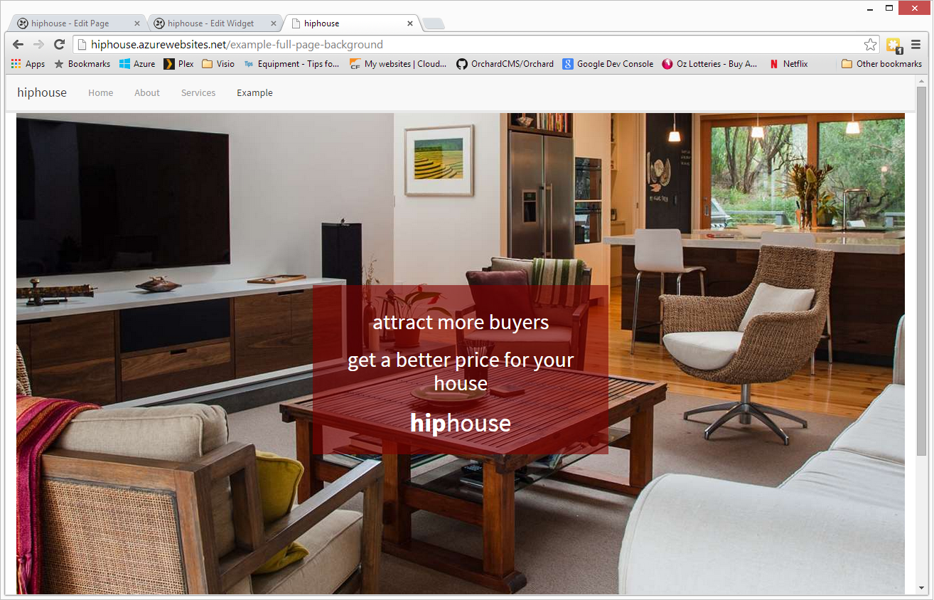
No matter how big the browser viewport, the initial image fills the window and the message in displayed centered on top of it (for small devices this is not quite true, as we try to make better use of screen realestate on devices that are usually vertical instead of horizontal). This blog is about how to create such a page.
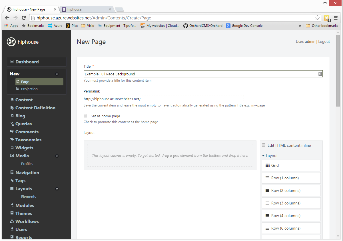
Create a new Page
It doesn't have to be a page: any layout will do. You can even create it in a Widget.
Add a Canvas Element
Drag a Canvas Element from the toolbar and drop it inside the existing canvas, so you end up with a canvas inside a canvas. This setup allows you to add further content below the fold that will be created by the second canvas.
Edit the nested Canvas element and give it a class of hip-head:
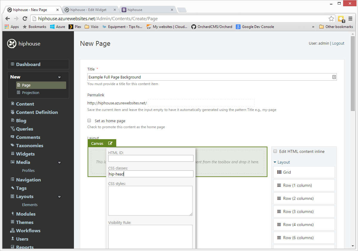
Adding the hip-head class to this canvas will cause it to fill the screen. Anything you place within this canvas will be displayed on top of it.
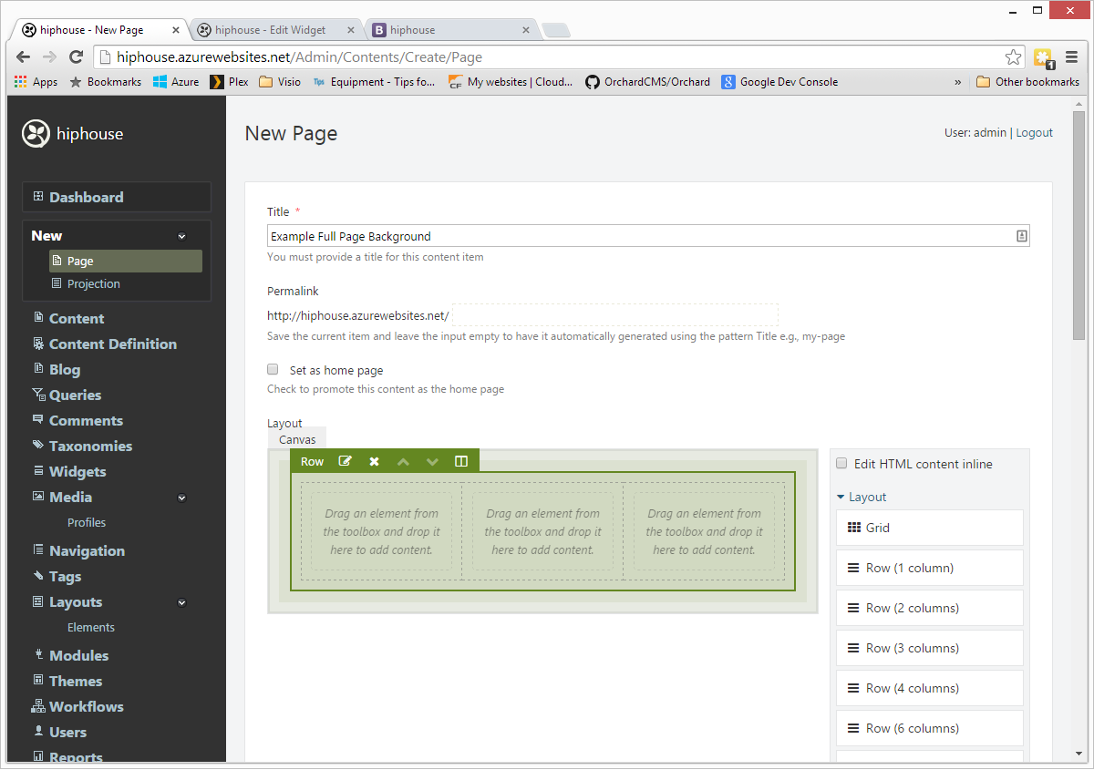
Add a Grid Element
Drag a Grid element from the toolbar and drop it onto the Canvas. Give is a class of hip-text:
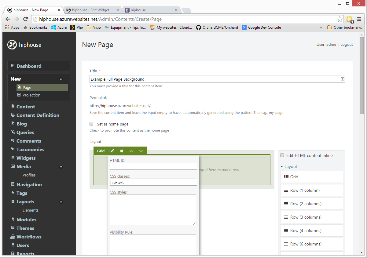
The hip-text class vertically centers the content within the initial screen.
Add Rows and Columns
Drag a 3-column Row from the toolbar and drop it onto the Grid:
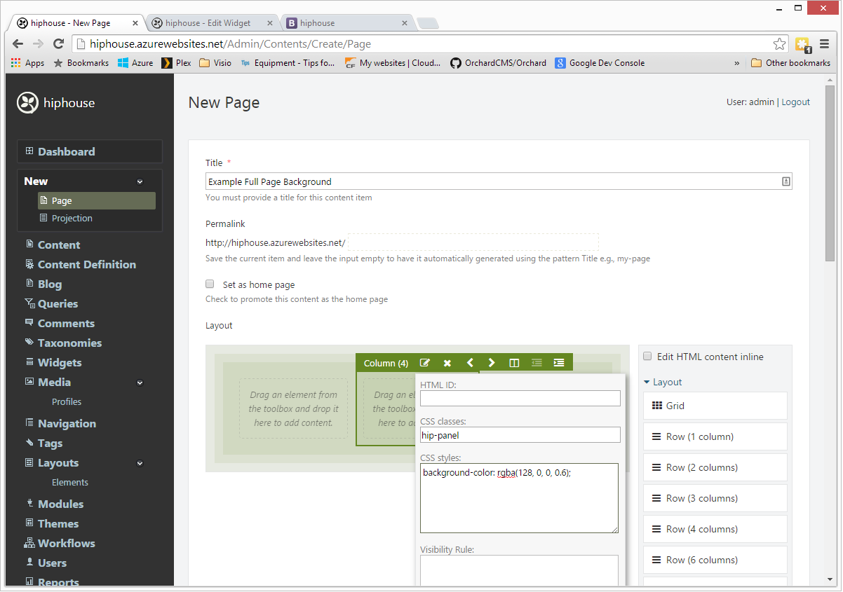
Set Center Column Properties
Edit the properties of the center column to give it a class of hip-panel and a background-color:
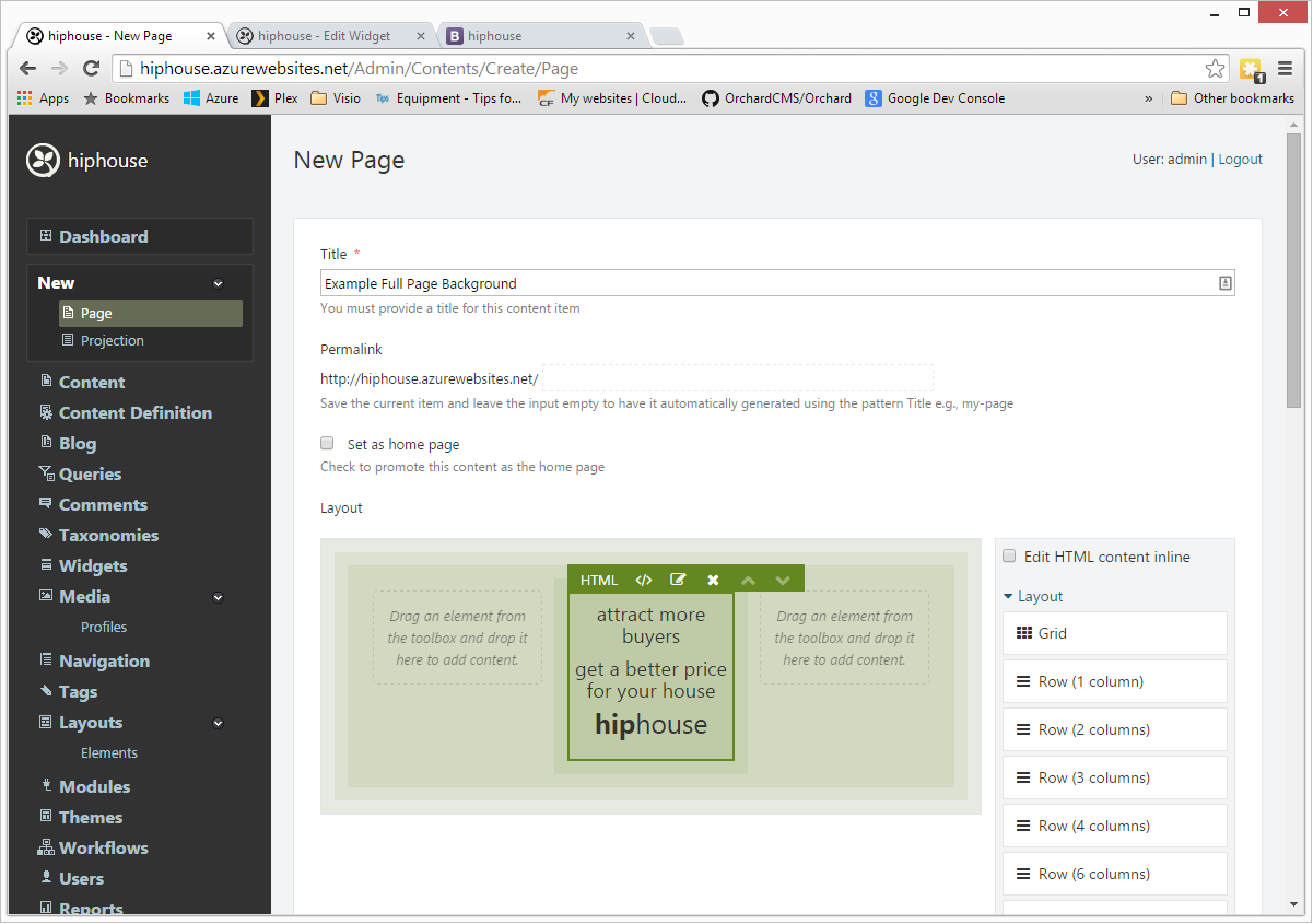
Add an HTML Element
Drag an HTML element from the toolbar and drop it on the center column. Put some text in the HTML element:
Variations
This is just an outline of how to set up the basics. You may want to take advantage of the following ideas.
Background Image
- A background image is set in the CSS. This is easily overridden by setting a Style property on the top-level canvas element:
background: #ff0000 url('/media/default/test/dsc_6451_1.jpg?width=2560&quality=60') no-repeat bottom center scroll;
- You might also like to experiment with different image settings, such as fixed instead of scroll, and setting repeat-x, repeat-y or repeat.
- The url above includes a querystring for ImageResizer. This is optional, but very handy if you want to change image properties. I have found that setting a large image with relatively low quality is a good compromise. If you set the quality too high you'll get a magnificent image on large desktops but it will be unusably slow on a broadband phone. Remember that the same image is going to get downloaded no matter what size the screen is.
Rows and Columns
I use a 3-Column Row to center the text box horizontally. You can vary this any way you like:
- Ditch the Row altogether and place an HTML Element directly. You will need to use CSS to set the position. If you do this, add the hip-panel class to the HTML Element to get some padding.
- Adjust the size of the left and right columns to make the center column wider or narrower.
HTML Element
You can do anything you want in the HTML Element:
- Use text-align to move the text about.
- Format the text how you like it.
- Set color background (including gradients). I find that setting an opacity around .5 looks good. Use the CSS rgba() function for this.
- Set borders and padding to suit.
- Add icons, logos, images, links, etc.
- Replace the HTML Element with a Grid or Rows and Columns and go to town.
LESS File
Here's the less file I used:
.hip-head {
     // This is the small-device styling
     background: url('/media/default/test/dsc_6451_1.jpg?width=2560&quality=60') no-repeat bottom center scroll;
     background-color: rgb(128, 128, 128);
     background-size: cover;
     height: auto;
     width: 100%;
     display: table;
     padding: 100px 0;
     .hip-text {
         display: table-cell;
         vertical-align: middle;
         .hip-panel {
             padding: 15px;
             h2 {
                 font-size: 30px;
                 color: #fff;
             }
             h1 {
                 font-size: 36px;
                 color: #fff;
             }
         }
     }
     // Override the small-device styling for desktop
     @media (min-width:768px) {
         height: 100vh; // NOTE: vh units here: 100vh=100% of vertical height of screen
         padding: 0;
    }
}
No Comments